Custom Charts
Custom Charts are available on the Enterprise plan, letting you can create your own dashboard widgets from your CRM data. This might be a summary of your customer accounts, sales revenue or maybe a custom field you’ve added. Charts are created in a similar way to your CRM reports, with output values displaying as pie charts, line charts, bar charts, gauges, or just a numerical value.
Create Custom Charts
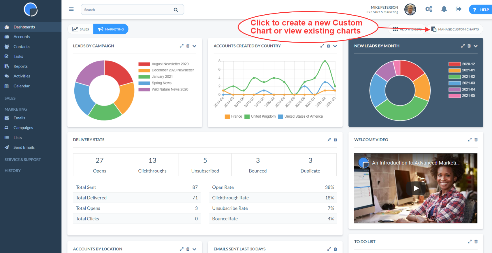
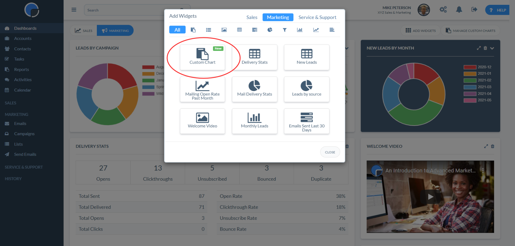
To create a Custom Chart, on your dashboard click “MANAGE CUSTOM CHARTS” then “+ ADD”
Alternatively, go to “ADD WIDGET” and select the Custom Chart widget.
From here you can create a widget by clicking “CREATE NEW CHART” or by selecting a previously created Chart.
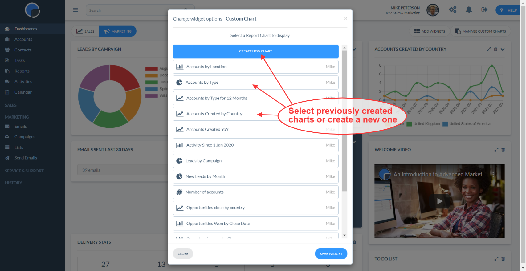
After clicking “Add Chart” you will be automatically be taken to a “Create Chart” screen, where the values will default to an example to help you get started.

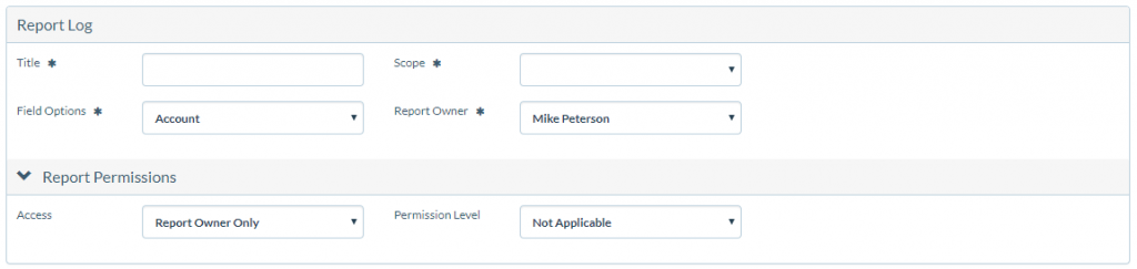
First, choose the title, your scope, field options, and report permissions in the “Chart Log” section. If you are running User Level Permissions you can also set the Chart Permissions.
Next, in the “Chart Options” section, configure your chart. As you make changes, you will see a “Chart Preview” of your widget update on the right.
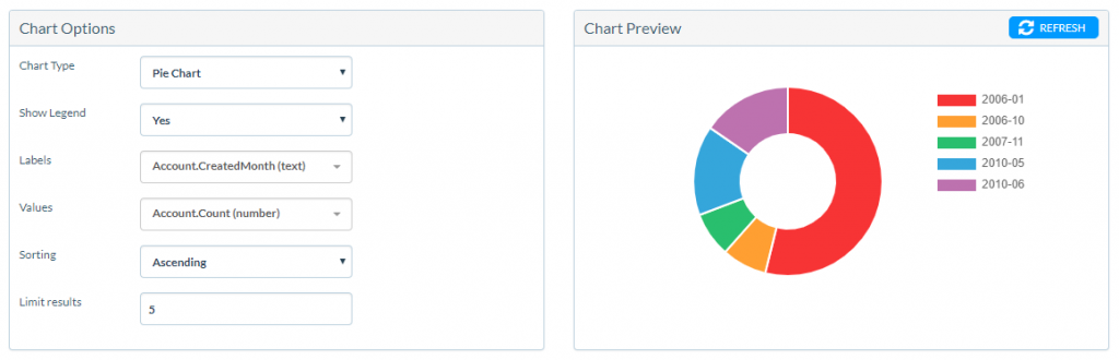
| Chart Options Explained
Chart type – pie chart, bar chart, line chart etc. Show legend – will show the labels in a separate block to the side (Mainly used for Pie Charts). Labels / X-axis – on a pie chart this will be the names of the slices and shown in the legend. On a bar/line chart, it’s the X/horizontal values. Values / Y-axis – on a pie chart this is the size of the slices. On a bar/line chart it’s the size of the bars or height of the line. Sorting – useful if you are wanting the top results rather than the bottom. e.g. if it was countries by the number of customers, and you wanted the most popular countries you would set Descending. Limit results – if you don’t want too many pie chart slices, or wanted to go back 3 months on a time based chart, or to show the top 5 of a set of data. Note 1 – for the Labels and Values, you can select most fields from Data Dictionary, but not all. We may need to adjust the available fields here, and/or create new derived fields for certain custom situations. Note 2 – that when you select “Gauge” or “Number” chart types, the fields change to a more limited set of options that fit those chart types. |
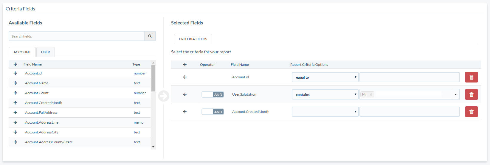
Finally, choose your data Criteria. This works in the same way as your Reports Criteria, letting you build a filter to drill down to the information you wish to capture in your chart.
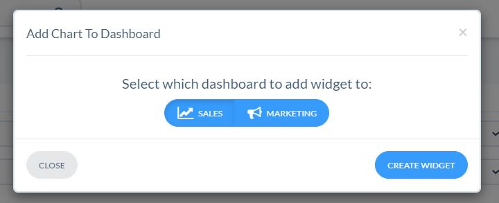
When you’re happy with your widget, click “SAVE” on the top-right of your screen and then “ADD TO DASHBOARD”.

Choose which Dashboard you want to display your new Custom Chart (Sales, Marketing or Service & Support) and then click “CREATE WIDGET”.
Your Report Widget is now created! You can now click to view your dashboard and re-position, edit, resize or delete as you wish.
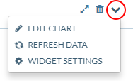
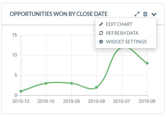
Note: To edit your Custom Chart, click the dropdown icon in the top-right corner. From the dropdown, you will be able to change the Chart being used by the widget with “WIDGET SETTINGS”, refresh the report data with “REFRESH DATA”, or update/edit the report criteria with “EDIT CHART”.
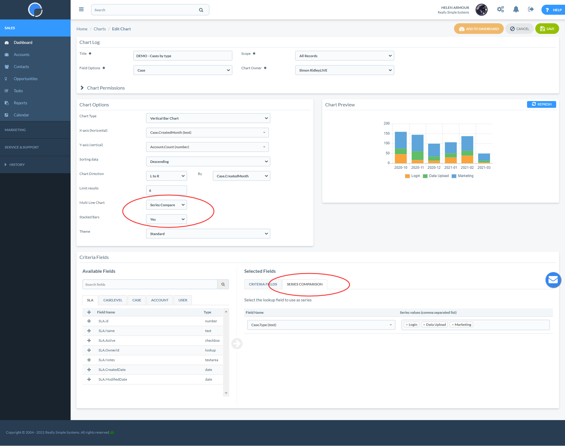
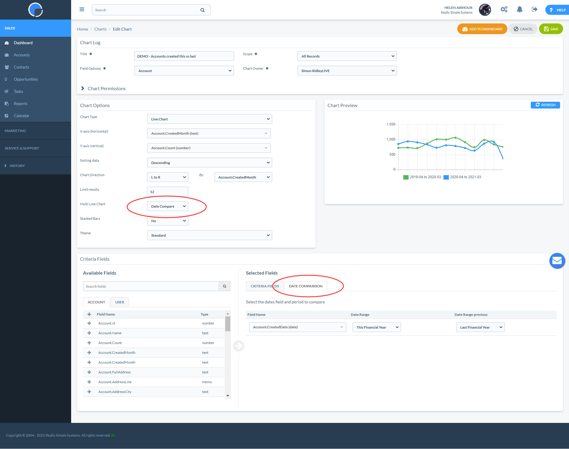
Multi-Series Charts
For more detailed analysis of your CRM data, you can create multi-series charts. Multi-series charts let you compare sets of data by “series” or by “date”. The Multi-series options can be used with Line Charts, Vertical Bar Charts and Horizontal Bar Charts.


For example, you might keep track of your new leads by Account type or location.
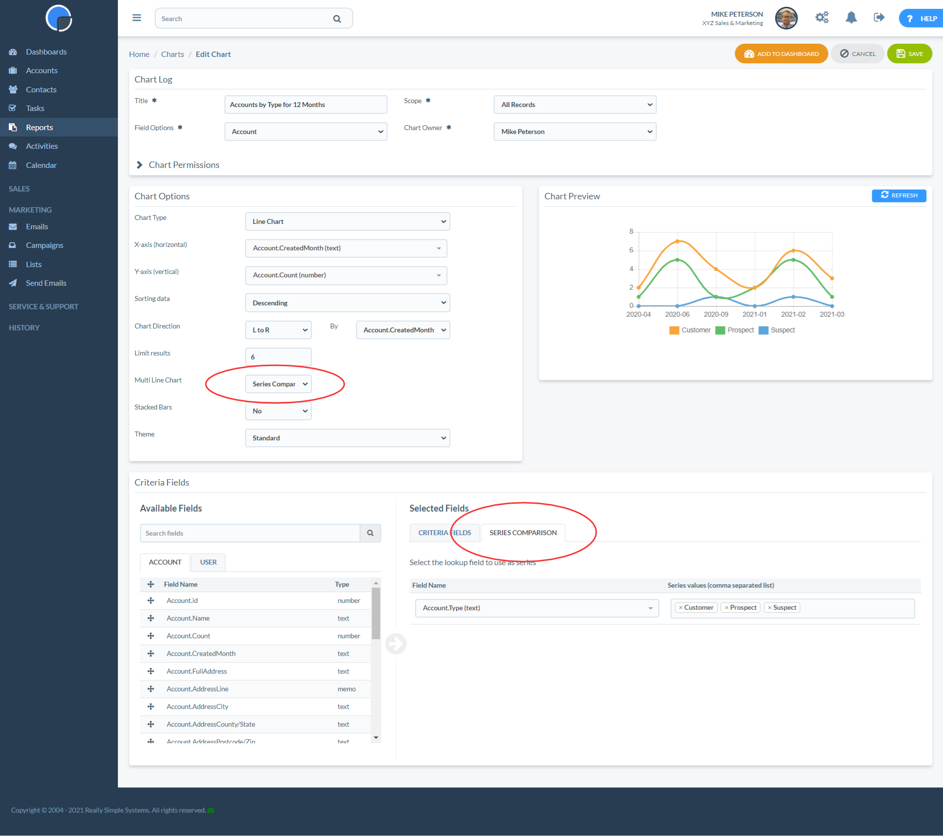
To create a multi-series chart, in the Chart Options select either “Series Compare” or “Date Compare” and filter your data as required in Selected Fields.
Using the Bar Chart options you can also create stacked bars to display your data.